Double K #2

Service
Visual Identity, Branding
About
Sports Social Media Agency
Date
June 2025
Technology
Illustrator, Photoshop

The Story Behind the DOUBLE KK Logo

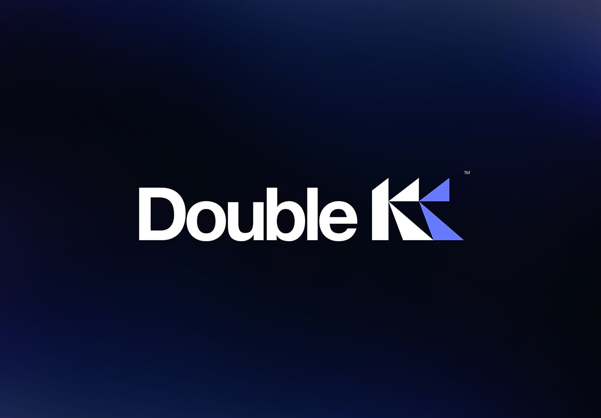
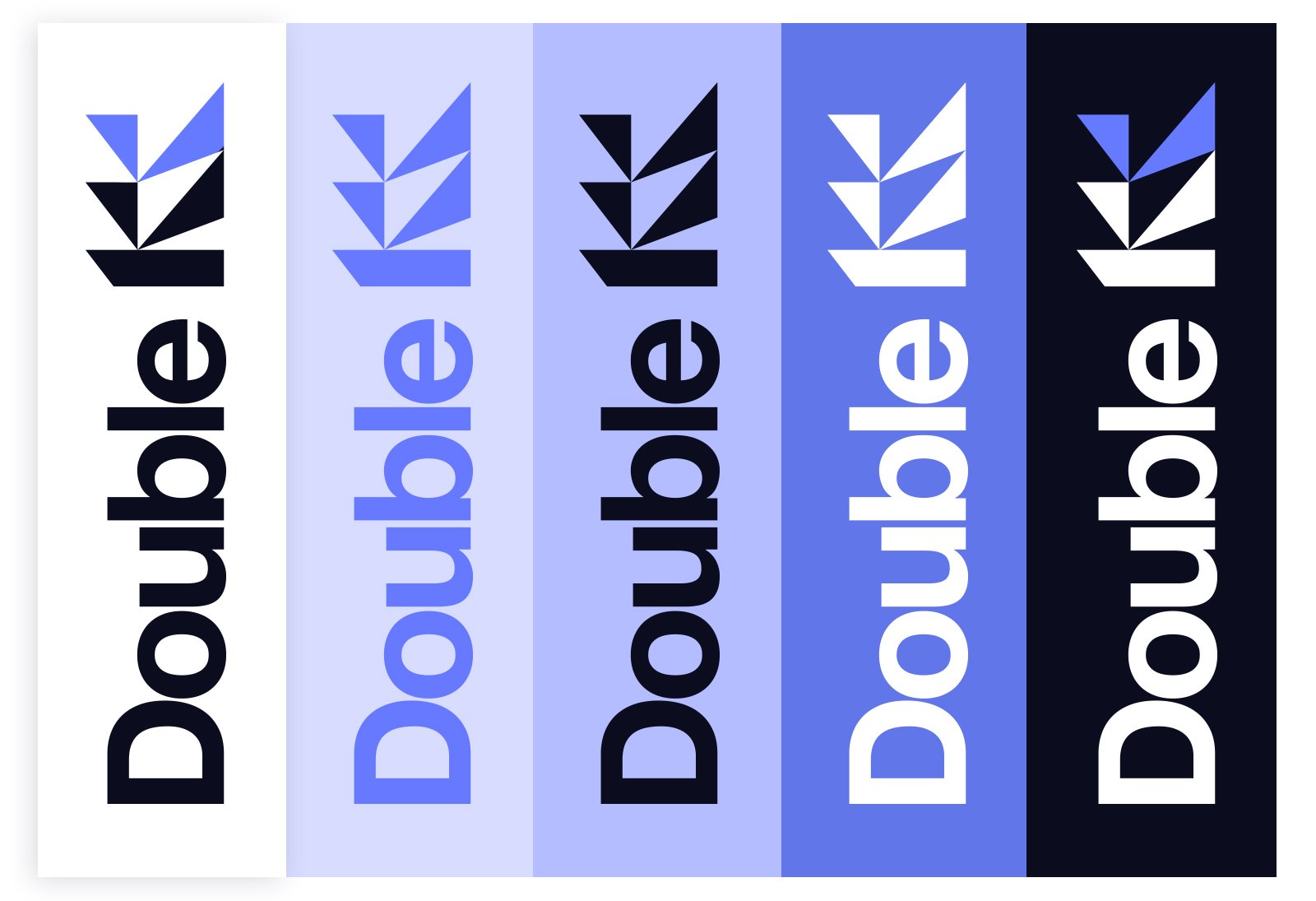
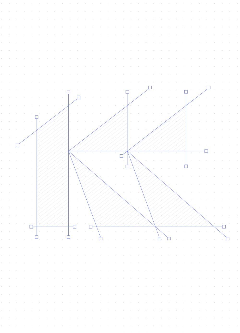
The KK logo was a story in itself for me. It was inspired by paper cut-outs, a playful and simple way to express design through triangular shapes, like fragments of paper coming together to tell a story. In this case, the story was built around two letters: KK. From that moment, I found the spirit I was searching for, extreme simplicity, strength, and clarity.

Defining the Visual Direction

The use of dark backgrounds leaning toward deep blue-black tones reinforced that spirit even more. At that stage, it became clear that this color palette and design direction were the perfect fit for KK’s field: sports design production and branding for sports companies across the Middle East and globally, including football and basketball clubs. The patterns, palette, and mockups all work together seamlessly, communicating the brand identity with ease, confidence, and power.

Typography and the Hidden Letter Concept

Typography played a critical role alongside the logo, to the point where the identity often doesn’t work without it. This leads to the visual manipulation within the second “K” in the name DOUBLE KK. I chose to partially hide it using a color from the palette. It is not a full “K,” but rather a fragment of it, which became a clever solution for both pronunciation and writing. The word “DOUBLE” comes first, while the two K letters remain visually connected, side by side, forming a strong and distinctive mark.

Salman Farid is a talented graphic designer who focuses on creating strong visual identities for companies.

© 2026 SALMAN FARID All right reserved