Double K - #3

Service
Visual Identity, Branding
About
Sports Social Media Agency
Date
June 2025
Technology
Illustrator, Photoshop

KK logo process was interesting tbh! Take a look at my design process.

In the process of developing the identity for the Double K brand, I wanted to focus on making everything more futuristic, aligning with the most visually striking trends in the world of design. I aimed to create a strong logo that effectively represents the brand’s identity and goals—achieving the highest quality in the sports marketing industry.

KK letters

For me, using sharp and bold elements to arrange the two K letters gave a sense of speed and reflected the dynamic nature of sports. Choosing a linear design approach was a way to evolve the brand without straying too far from its previous identity, as the original logo also followed this style.

Atmosphere

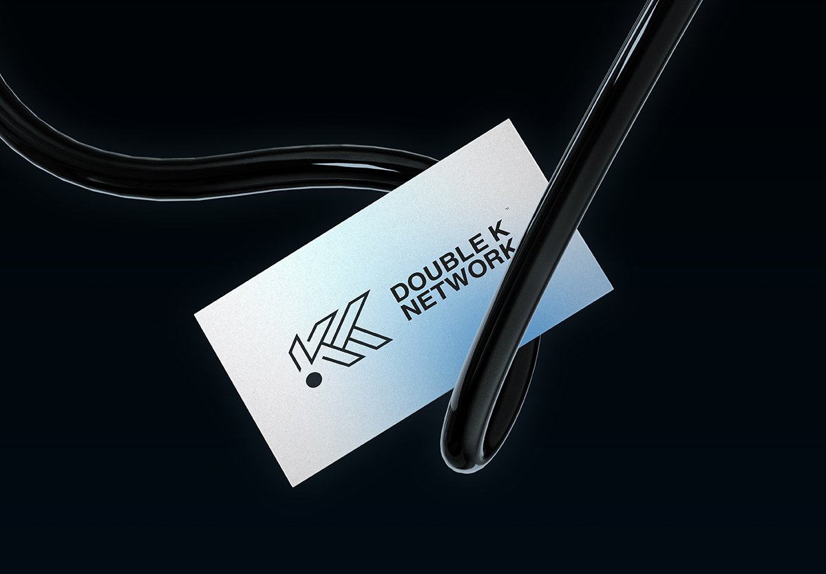
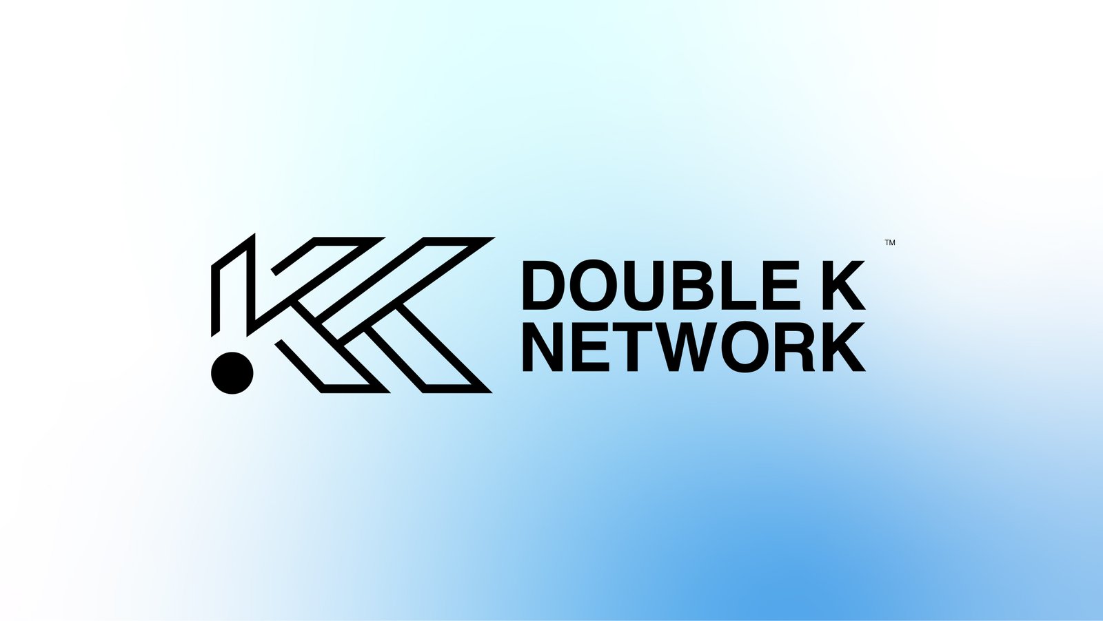
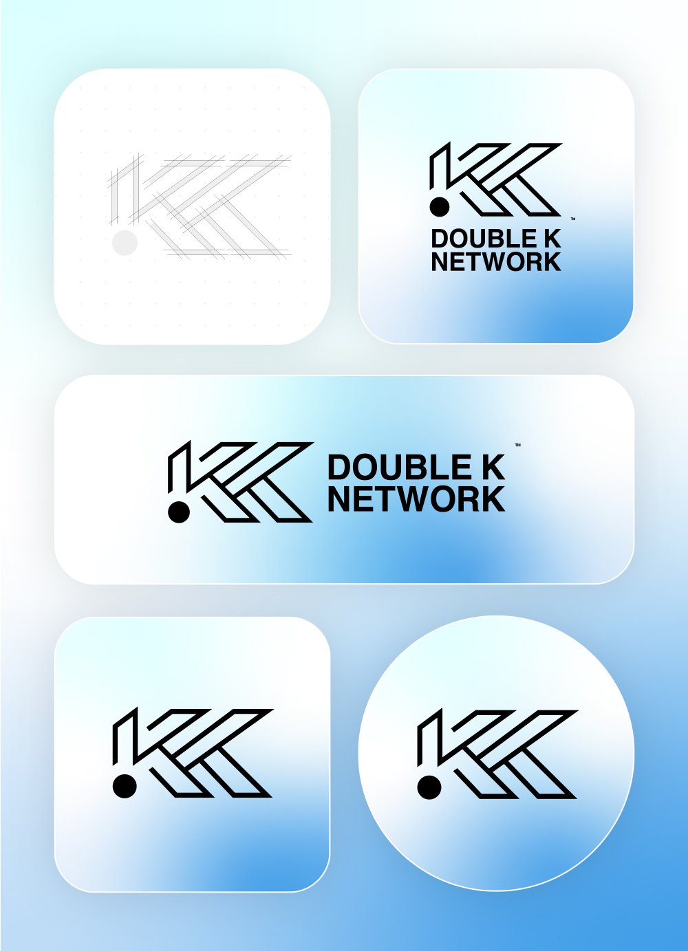
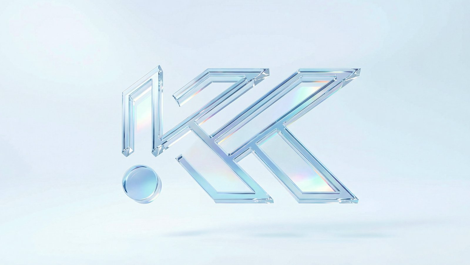
As for my choice of light gradients, they symbolize adaptability and the ability to shift between the different brands we work with. This highlights that we are the most flexible company when it comes to handling diverse brands with unique identities and directions. The decision to make light blue the dominant color in the gradient wasn’t just because it was part of the brand’s previous identity, but because it represents peace and neutrality—core values of our company when working with various sports brands, regardless of their biases and challenges.

Salman Farid is a talented graphic designer who focuses on creating strong visual identities for companies.

© 2026 SALMAN FARID All right reserved