CRAFT
Agency

Service
Visual Identity, Branding
About
Sports Social Media Agency
Date
December 2025
Technology
Illustrator, Photoshop

CRAFT Agency Logo Design Process

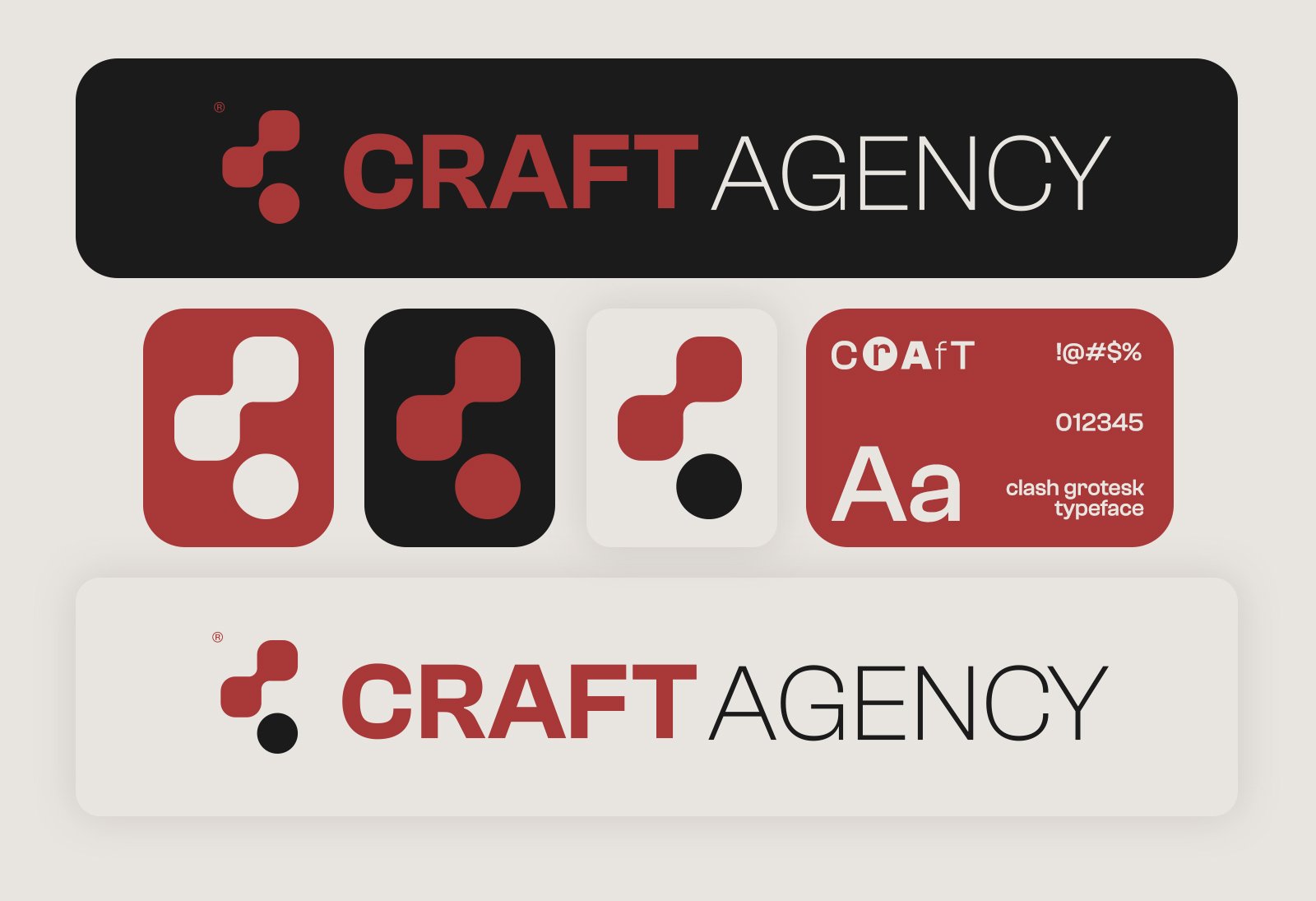
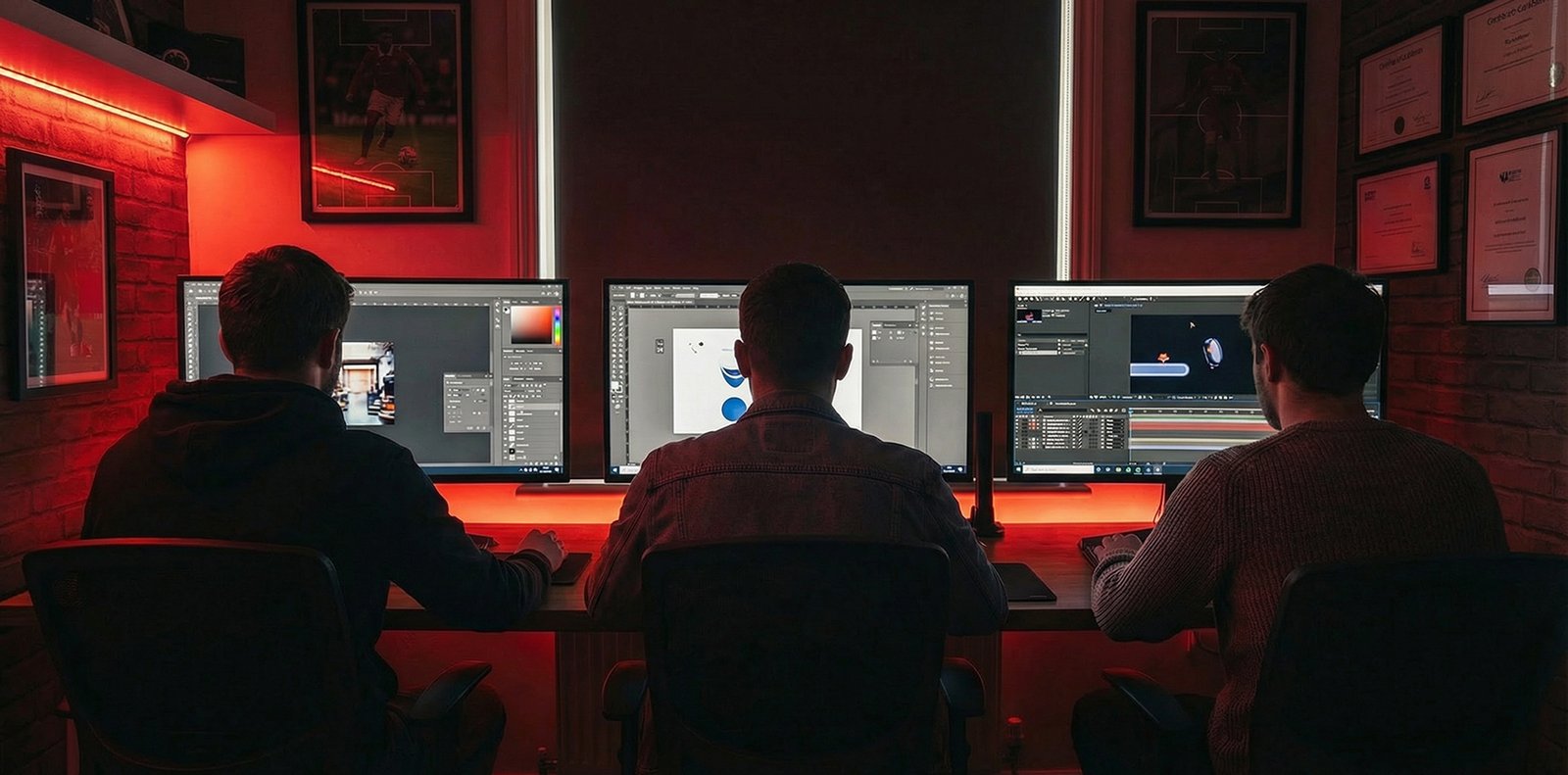
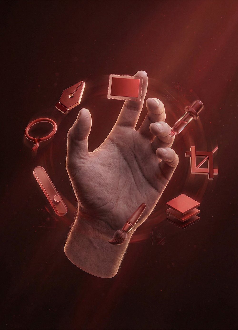
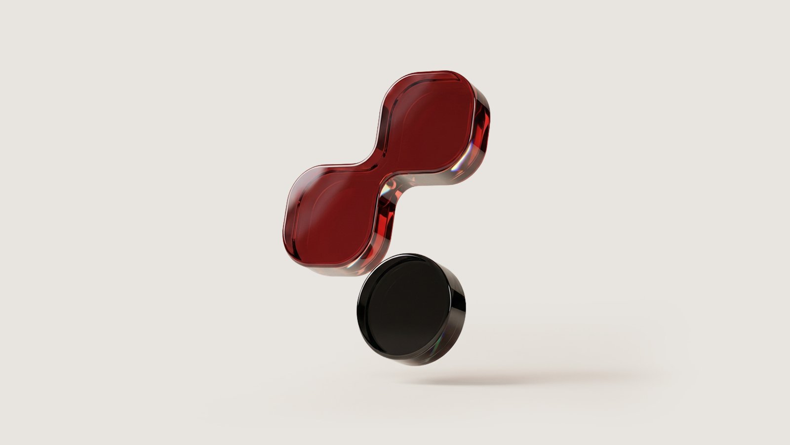
I started working on the Craft agency logo by exploring ideas connected to the meaning of the word “craft” itself, the idea of a skill, a process, and how things are carefully made. I experimented with combining two connected squares and a circle beneath them to form the letter “C.” What seemed simple at first quickly proved otherwise. So let me take you through the full process, step by step, and how the concept evolved through reduction, focus, and intention.

Eliminating What Doesn’t Belong

At a certain point, it became necessary to eliminate many ideas. Anything that did not truly express craft was removed. Generic shapes like simple circles, pulse lines, a regular letter “C,” or abstract art with no visual relation to patching, assembling, or collage had to go. This phase was about stripping the concept down until only forms that genuinely reflected craftsmanship and construction remained.

Building Identity Through Palette and Form

After that, I decided to work with this color palette, refining it in consultation with the client. What I loved about it was how it expressed precision and calm, but with intelligence, speed, and strength at the same time. Translating these feelings into the logo was my main goal. Craft is a media company with real craftsmanship at its core, confident and powerful. That confidence shows through the icon and the typography, leading us to a visual identity that supports their work and allows the brand to grow stronger and more impactful over time.

Salman Farid is a talented graphic designer who focuses on creating strong visual identities for companies.

© 2026 SALMAN FARID All right reserved